Keyboard Labels
UX DESIGN
CLINICAL EQUIPMENT
Background
Within the Globe Pulsed Field System, software operators rely heavily on keyboard shortcuts to navigate workflows efficiently during procedures. While experienced users may eventually memorize these shortcuts, the large number of commands and infrequent use of certain functions created moments of hesitation and increased cognitive load during time-sensitive tasks.
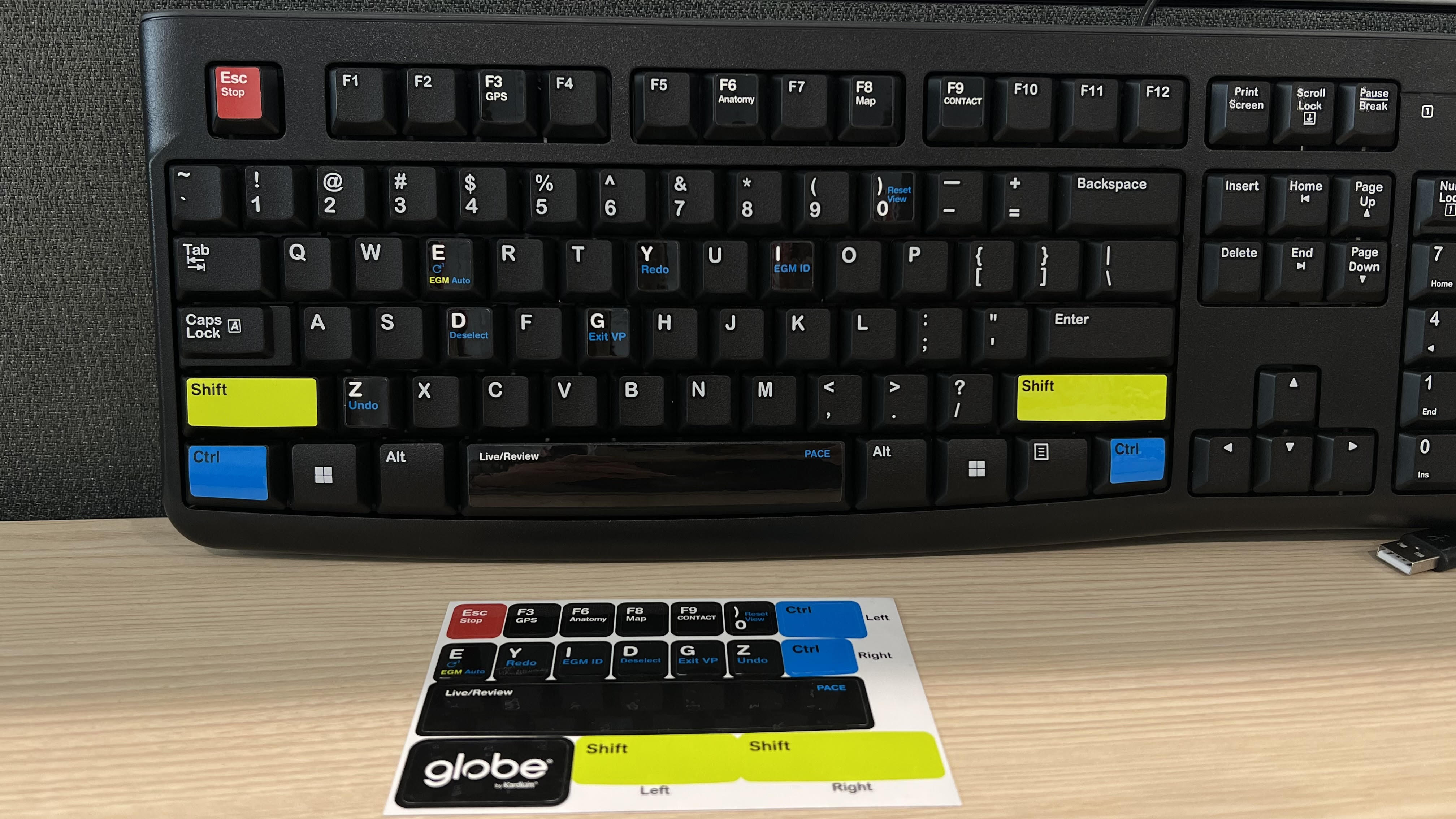
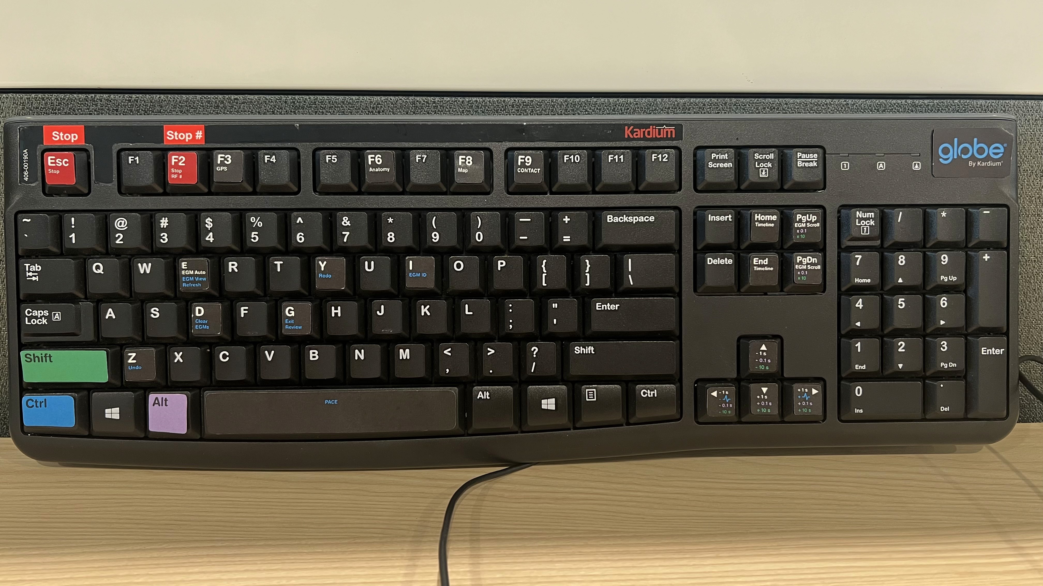
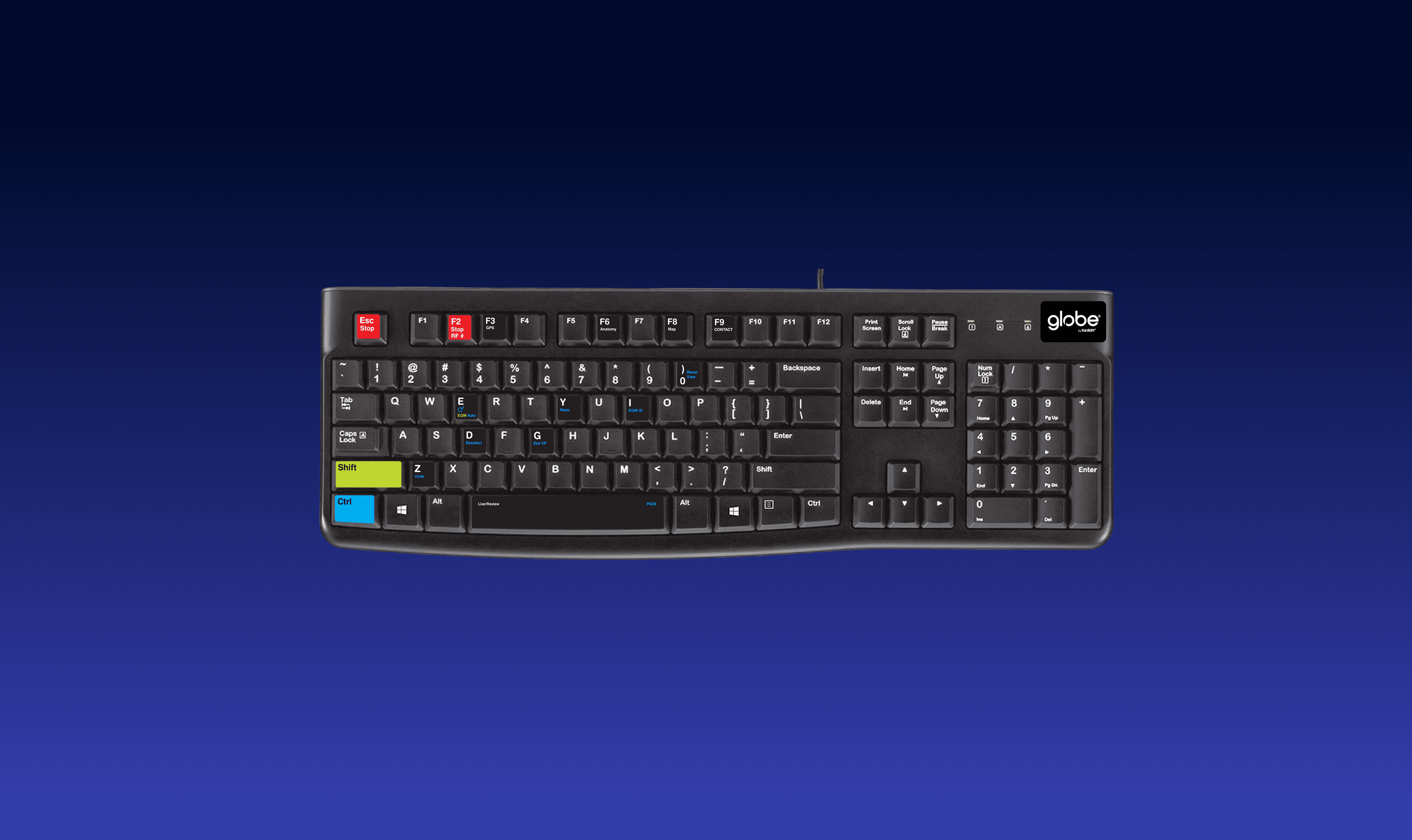
To help improve workflow efficiency and reduce reliance on memory, I worked on designing a set of physical keyboard shortcut labels for the Globe system.
The Challenge
The goal of this project was to create a keyboard labeling system that:
Helped software operators quickly recall important shortcuts
Reduced visual clutter while maintaining readability
Created a recognizable and consistent color system across shortcut categories
Maintained durability under long-term daily use
Matched the physical keyboard seamlessly in both appearance and fit
Because the labels would be used repeatedly in clinical environments, durability and clarity became just as important as the visual design itself.
Designing for Recognition and Usability
A major focus of the project was building a visual system that allowed users to quickly recognize different categories of shortcuts at a glance.
To achieve this, I explored:
Color systems for grouping shortcut types
Contrast ratios for readability under different lighting conditions
Font sizing and spacing for quick scanning
Label hierarchy to prioritize important actions
Visual consistency across all shortcut accelerators
Accessibility and readability were also key considerations, especially since operators needed to identify shortcuts quickly during active workflows.
Precision and Collaboration
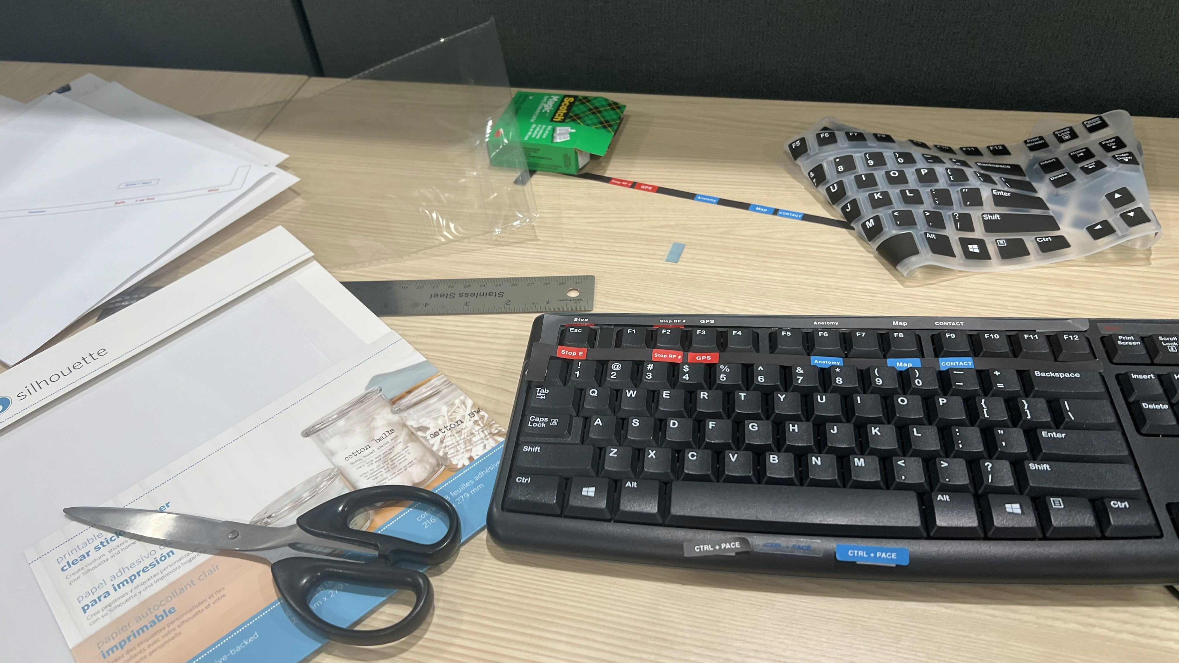
Because this project involved physical production, precision was critical.
I collaborated closely with engineers and production teams to ensure:
Exact keyboard measurements down to the millimeter
Accurate font sizing and alignment
Proper material selection for long-term durability
Consistent color matching between printed labels and digital specifications
Compatibility with real-world keyboard usage and wear over time
I also tested early prototypes directly on keyboards over extended periods to evaluate readability, adhesion, and long-term appearance under repeated daily use.
Reflection
This project taught me how UX design extends beyond digital interfaces.
Designing for physical interaction introduced new considerations around material durability, manufacturing precision, ergonomics, and long-term usability. It also reinforced the importance of designing systems that support recognition over recall, especially in fast-paced clinical workflows.